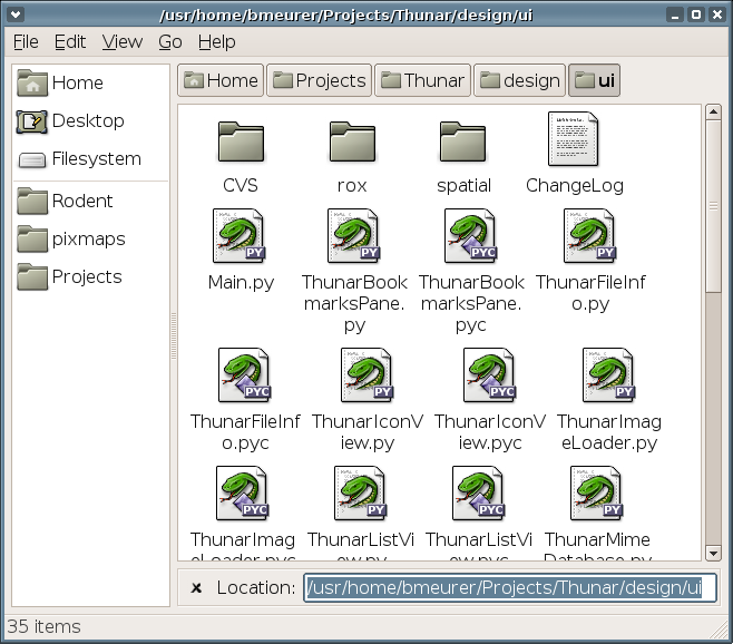
Thunar Firefox-like location bar (the 2nd skin)
Just came up with a better idea for the location bar layout:
It's now very similar to what Firefox does. The major difference is, that it's not associated with the statusbar as in Firefox, instead it's associated with the main view (icon/list view), which makes more sense.
It's important to have a user-visible way to get rid of the location bar again, even if there's already Escape or focus-out.
